
Introduction
Useful technical analysis indicators for trading assets help traders find estimated entry and exit points for their positions. Also, technical indicators help identify trend direction, strength, and reversals. I described five technical analysis indicators in the previous article: MA, MACD OBV, A/D Line and the stochastic oscillator. In this article, I introduce four more prevalent indicators among traders. I highly recommend that you read the previous article to better understand this one, as I will refer to the gadgets I described earlier.
Relative Strength Index
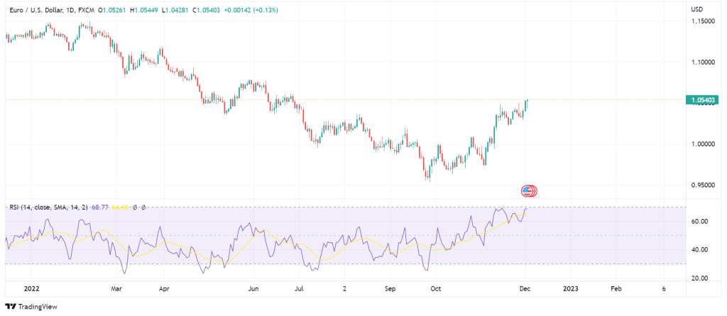
The Relative Strength Index (RSI) is a useful technical analysis indicator used for identifying price momentum. RSI compares the asset’s strength when the asset’s price is in a downward trend with when it is in an upward direction. RSI increases when the number of up days increases and vice versa. The comparison helps traders predict the asset’s price movements. The indicator gauges an asset’s value and the velocity of the price change to identify whether the asset is overbought or oversold. In addition, traders use RSI line crossings to identify short or long signals. Overall, RSI can help traders foresee price movements, identify trends and reversals, illustrate overbuying and overselling, and get short or long signals.
How to Interpret Data from Relative Strength Index?
The RSI line graph has a scale of 0 to 100. Typically, when the RSI line is above 70, it indicates overbuying, and when it is below 30, it shows overselling. If RSI’s highest movement is below 50, it can be a signal for a downward trend. I should note that RSI is not reliable when the chart is trending and may give you the wrong idea of the price movement. Instead, traders use RSI in trading ranges.
Additionally, traders should confirm the RSI short or long signals with the trend line. Therefore, a long signal by RSI is valid only when it conforms with the trend line. Conversely, if RSI signals a bearish movement, the trend line should confirm it.
On the whole, in an upward trend, the RSI moves above level 30 and frequently hits 70. Contrarily, in a bearish trend, the RSI usually moves below 50 and hardly hits 70. Traders can determine trend strength based on the RSI movements. For instance, if RSI does not bypass 70 in a series of consecutive candles in an upward trend, it means that the trend is wearing off. On the other hand, if in a descending movement, the price does not frequently hit 30 and moves above 50 in a succession of candles, it means that the downward trend is likely to reverse.
It is worth mentioning that when the RSI is in oversell in continuation of a strong trend, the price may continue to go down. The same is also true about overbuying. Therefore, being in either territory does not mean the trend will change, considering how strong the trend is.
Divergence in RSI
Divergence in RSI happens when the graph shows a change in momentum, but the price is still following the same trend. If RSI indicates a lower low followed by a higher low in a downward trend and goes above 30, it can mean a change in direction and signals long positions. On the other hand, in a bearish divergence, a lower low follows a higher low, and the RSI goes below 70 while the price is still in an upward trend. Of course, RSI divergence is quite rare in assets that have stable price movements.
RSI Reversals
RSI reversals can be positive or negative. A positive reversal happens when RSI shows a lower low while the price reaches a higher low. The positive reversal is a sign of a bullish market and long positions. On the contrary, in a negative RSI reversal, the RSI sets a higher high, but the price reaches a lower high. The negative RSI reversal signals a bearish trend and short positions.
RSI Swing Rejections
RSI Swing Rejection is another signal traders use to take long or short positions. Bullish swing rejection is when RSI shows oversell, but the line goes above 30, declines without going below 30, and goes above the previous higher low. Bullish swing rejection adds up to a bullish trend and signals long positions. In a bearish swing rejection, the RSI descends from level 70, attempts to pull back but does not reach 70, and then goes below the previous lower high. Bearish swing reversal conveys a downward trend and short positions.
Bolinger Bands
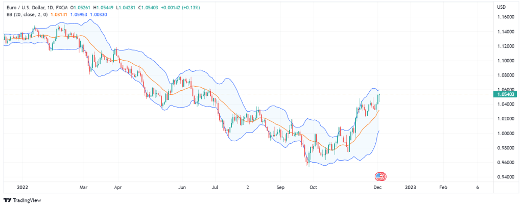
Bollinger Bands, named after its designer, John Bollinger, is another gadget of useful technical analysis indicators for understanding whether the asset is in the state of overbuying or overselling. Bollinger bands consist of three lines. The middle band is an SMA from the last 20 days. The upper band is the positive standard deviation from the SMA, and the lower is the negative deviation from the SMA. Of course, the values are customizable, and users can set the SMA for longer SMAs. Standard deviation indicates how dispersedly the closing price points are distributed on the chart.
How to Interpret Data from Bollinger Bands?
Generally, the common opinion is that the asset is overbought when the price approaches the higher band. Conversely, when the price moves near the lower band, it means that the asset is oversold. Also, if the distance between the upper and lower bands increases, it means that the price movements are volatile. On the other hand, if the upper and lower bands are closer to each other (squeeze), it shows less volatility in the price movements. In case the upper and lower bands are closer, it signals future volatility and possible entry points. Contrarily, when bands have a great distance among them, it may signify a decline in volatility and possible exit points. Breakouts in Bollinger Bands (when the price goes higher than the upper or lower than the lower band) indicate a significant event in the market.
The Bollinger bands illustrate the asset’s price path but cannot give traders short or long signals. In other words, traders cannot extract information about opening or closing trades by relying on Bollinger bands. They should use other non-correlated indicators, such as RSI, for more precise signals.
Fibonacci
Fibonacci is the nickname of an Italian mathematician. He introduced a sequence of numbers in which each number is the sum of the last two numbers. The sequence typically starts with 0 and 1, and the first numbers in the sequence include 0, 1, 1, 2, 3, 5, 8, 13, 21, 34, 55, 89, and so on. In the Fibonacci sequence, when the numbers get larger, each number is 1.618 times greater than the previous number. 1.618 is known as the golden ratio because natural phenomena seem to follow the ratio. For example, if we divide the number of male bees by female bees in a hive, we get the number 1.618. The golden ratio is also significantly observable in art and architecture. For instance, Da Vinci pained Mona Lisa in a golden ratio rectangle.
Financial analysts have applied the Fibonacci sequence and the golden ratio in the market analysis as well. That is, the price movements tend to react to the golden ratio. Traders use four percentages of the golden ratio for technical analysis. The percentages include 0%, 23.6%, 38.2%, 50%, 61.8%, and 100%. Traders use the Fibonacci sequence as another type useful technical analysis indicators. The most prevalent way of interpreting data from the Fibonacci sequence is through Fibonacci retracement, which I explain below.
Fibonacci Retracement
This method takes the highest and lowest points of the price in a given time frame and lays a grid on the chart based on the points. The grid contains horizontal lines drawn based on the above golden ratio percentages. The highest line indicates 100%, and the lowest one shows 0%. Of course, the values are customizable, and traders can set the lines to preferred Fibonacci levels or add/remove desirable levels to the grid.
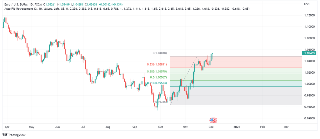
The gridlines represent potential reversal points and support and resistance levels for the price movements. Traders can identify the retracements based on the Fibonacci levels and look for entry and exit points. Fibonacci retracement works best in conjunction with other technical analysis methods, including MAs, momentum oscillators, candlestick patterns, etc. For instance, when the price reaches a significant level in golden ratio percentages, say 61.8%, and the on-balance volume shows an overbuy at the same level, you can expect a trend reversal.
Ichimoku Cloud
The Ichimoku cloud is another instance of useful technical analysis indicators. This tool gives information such as momentum, trend direction and support/resistance levels based on multiple MAs. The Ichimoku cloud consists of five lines, and the area between two of the five lines is shaded and referred to as the cloud.
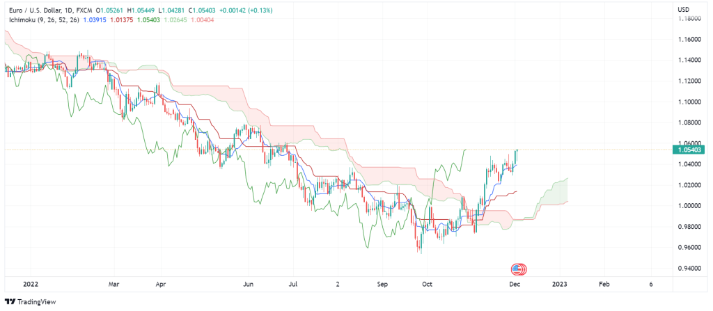
The first line is the Conversion line, also known as the Tenkan-Sen line (blue by default), which is based on a 9-period average of the highest and lowest closing prices. The second line (crimson by default) is the Base line (or Kigun-Sen) and shows the 26-period average of the highest and lowest closing prices. The third line is the Lagging span, AKA Chikou span, which is usually in dark green. The Lagging Span shows how much the asset’s closing price was 26 days ago.
The fourth line is Leading Span A (Senkou Span A) and is usually in light green. Leading Span A measures the momentum and predicts the support and resistance levels in the future using a 26-period average. Finally, the fifth line is Leading Span B (Senkou Span B), which is light red by default. Senkou Span B has the same function as Senkou Span A. The difference between the two is that Senkou Span B is slower because it is calculated based on 52-period data. The area between the Leading Span A and B constitutes the Ichimoku cloud.
How to Interpret Data from Ichimoku Cloud?
The Base line indicates the main trend in the asset’s price movements. If the price moves away from the Base line, it means that you can expect a retracement. Also, the Base line and the Conversion line are drawn to each other, and when they are close and have the same direction, they indicate strong resistance/support levels. You can also use the crossovers to get short and long signals. If the Conversion line cuts above the Base line, it signals a buy position. Conversely, if the Conversion Line cuts below the Base line, it is a sell signal.
The Ichimoku cloud itself shows the support and resistance levels in the chart’s past. The larger the clouds (distance between Leading Span A and B), the stronger the support/resistance levels and vice versa. If the price breaks above a large cloud, it means it has passed a significant support/resistance level, and the uptrend will continue strongly. On the contrary, if the price breaks below a large cloud, you can expect a definite downward trend. Breaking above or below a small cloud cannot indicate a strong trend and can be a retracement.
Other readings of the Ichimoku cloud are based on the Leading Span A and B. If the value of Leading Span A is larger than Leading Span B, the cloud will be colored green. A green cloud indicates an uptrend. Inversely, if the Leading Span A is smaller than B, the cloud will be colored red, which is a sign of a downward trend. I should note that it is fairly risky to open positions when the price is moving within the cloud, and traders should wait until the price goes above or below the cloud. Furthermore, the Ichimoku Cloud indicator works best for time frames above four hours and is not a good indicator in smaller timer frames.
Final Words
I described four other useful technical analysis indicators that can help you figure out the trend direct, trading volume, support/resistance levels and reversal. There is no single technical analysis tool that can meet all your analytic needs. You should make a selection of the ones that you are comfortable working with. Finally, I will introduce more useful technical analysis indicators in the upcoming article. You can read more at https://academy.investopedia.com/?aca_ref=header_home_link_1.
Disclaimer
The guidelines we mentioned in this article are only for educational purposes. Please do not regard them as financial advice. Note that investing in financial markets requires a comprehensive trading plan. Any rash decision can quickly spoil your capital.