
Introduction
Probably every novice trader’s nightmare is interpreting the price movements in the trading chart. The technical analysis mainly indicates an estimated entry and exit point for a position based on the asset’s price movements in the past. In other words, technical analysis helps you predict the next move based on the previous moves. But what are the metrics that help you identify the patterns in the price movement? What does each pattern tell you? What should you do when you observe a particular pattern in the trading chart? I will introduce useful technical analysis indicators you can apply in the Forex and Crypto Market.
Since volatility in the crypto market is much higher than Forex, these indicators might be more responsive in the latter. It goes without saying that the indicators cannot yield exact buying or selling signals. They merely help you better understand the chart. In addition, you do not need to apply all of them on the trading chart. Instead, select a few indicators that you are comfortable working with. Too many indicators can disturb your concentration and decrease the accuracy of your analysis.

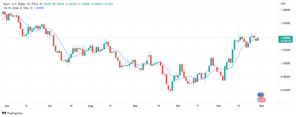
Moving Average
Moving Average (MA) or Simple Moving Average (SMA) is a technical method for identifying the trend in the chart. You can also use MAs to get a sense of an asset’s support and resistance levels in the trading chart. MA uses data from previous price points to reveal an asset’s price direction. What MA does is that it divides the sum of candlesticks’ closing prices by the number of candles. For example, in a daily time frame, a seven-day MA adds up the closing points of the asset’s candles and divides it by seven. So, if the last seven closing prices are 23.02, 24.98, 27.01, 30.0, 19.70, 22.37, and 20.56, the SMA calculation will yield 167.64 ÷ 7 = 23.94.
Exponential Moving Average
Exponential Moving Average (EMA) is another type of MA. EMA calculates the mean similarly to MA, but the difference is that it emphasizes the most recent candles in the calculation. In other words, the new candles have more significance compared to the older ones. On the contrary, in SMA, all the calculated values receive the same level of significance. You can use 12 to 26-day EMAs for short-term and 50 to 200-day EMAs for long-term analysis. I should note that using short time frames for calculating MA yields closer MAs to the actual price than long time frames. The use of EMA is for getting confirmation for changes in the trend line.
How to Interpret Data from MA and EMA?
Generally, if the asset’s price movements are above the MA line, it signals long positions. Conversely, you can take short positions if the price movements are below the MA line. Also, when the price crosses the MA, it can be a sign of trend change. Additionally, a common way of getting buy or sell signals from MAs is by applying several MAs of different time frames on the chart. For instance, you can set a seven-day and a thirty-day MA on the chart and receive signals from the points where the MAs cross. Based on the MA crossover strategy, if the short-term MA crosses the long-term MA in an upward direction (the golden cross), it gives a buy signal. On the other hand, if the short-term MA crosses the long-term MA in a downward trend (the death cross), it is a sell signal.
I should state that MAs work best when there is an ongoing strong trend in the asset’s price movements. That is, MAs cannot yield reliable results in a ranging or choppy chart. You can get around this problem by applying shorter MAs on the chart, but that is not always effective. Moreover, you should remember that MAs use historical data from the chart, which may not always indicate future movements accurately.
Moving Average Convergence Divergence
Moving Average Convergence Divergence (MACD) is another technical analysis technique that indicates the momentum as well as the trend direction and strength based on different moving averages. The indicator is very popular among traders because it is simple and reliable. MACD consists of three elements. The MACD line (blue by default), the signal line (red) and the histogram. The MACD line indicates the distance between the moving averages, and the signal line indicates the momentum and gives short or long signals. The histogram represents the difference between MACD and signal lines. The MACD line shows the subtraction of the 12-period moving average from the 26-period moving average. The signal line reveals a 9-period moving average of MACD.
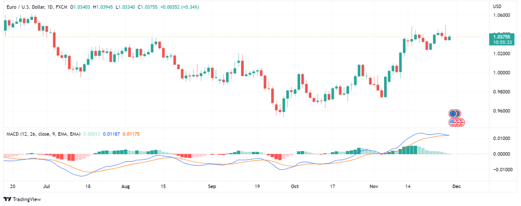
How to Interpret Data from MACD?
The MACD line moves in a range between 1 and -1. More often than not, when the MACD is above 0, it is a buy signal; when it is below 0, it is a sell signal. More specifically, if the MACD line crosses the signal line downward, it is a sell signal which can be confirmed if the MACD is below 0. Conversely, if the MACD line crosses the signal line upward, it is a buy signal which can be confirmed if the MACD is above 0. Nonetheless, MACD can only be helpful if you are trading in a short time frame (less than 26 days). It cannot be accurate in more extended time frames. Also, the gadget works best when a trend has formed and cannot be precise in a choppy chart.
On-Balance Volume
On-Balance Volume (OBV) is a momentum indicator (one that analyzes the speed of price change) that uses the volume flow to predict the upcoming price movements of an asset. This strategy is based on the belief that volume plays an important role in determining the asset’s price. Based on OBV, when there is a significant change in the asset’s trading volume without a substantial change in its value, the asset’s price will eventually go down or up. OBV uses the current volume and compares it with the volume in a given time in the past and tells you whether the asset will experience an inflow or an outflow. The OBV value depends on the starting point of the period to which we are comparing the current volume.
There are three rules in calculating OBV. First, if today’s closing price (A) is higher than yesterday’s closing price (B), current OBV equals previous OBV minus today’s volume. Second, if A is lower than B, current OBV equals previous OBV minus today’s volume. Third, if A is the same as B, the current OBV equals previous OBV.
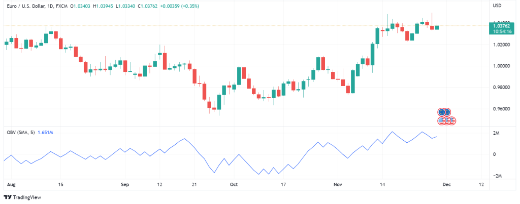
How to Interpret Data from OBV?
Working with OBV is a bit sly. OBV strategy differentiates between smart money (capital from institutional investors) and mutual funds (the sum of individual investors’ capital). The trick is that when retail traders begin to sell an asset, institutional investors buy it. While institutional investors are buying the asset, the volume increases significantly, but the price change is not as significant. Then, the retail investors selling power wears off, and the accumulated volume pushes the price upward. At this point, retail investors rebuy the asset, and institutional investors go short on the asset.
The primary use of OBV is that it indicates whether a change in the trend line is a reversal (leading to a new trend) or a retracement (a temporary change in the same trend). Also, OBV helps you trace the smart money inflows and outflows in the market. This gives you a better sense of when to buy or sell an asset. However, while OBV can predict the future price direction, it cannot tell you how it happens. Also, a sudden large increase or decrease in the volume distorts the OBV calculation. Of course, you can add an MA to the OBV, and if the OBV makes a concurrent breakout with the MA, you can confirm it.
Accumulation / Distribution Line
The Accumulation / Distribution line (A/D line) is a way of understanding an asset’s capital inflow and outflow. This technical analysis indicator uses price and volume to examine whether investors are depositing or withdrawing their money from the purchase. In other terms, the A/D line analyzes the balance between supply and demand for the asset. The A/D line is similar to OBV, but it is more comprehensive. The difference between OVB and the A/D line is that OBV only uses the closing price in a given period, while the A/D line calculates the closing price in relation to the trading range in the given period. Nevertheless, OBV works better in some cases, and the A/D line works better in others; I cannot say one is more accurate than the other.
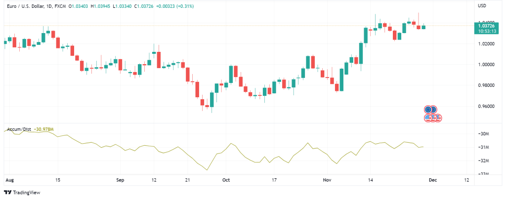
How to Interpret Data from Accumulation / Distribution Line?
If the A/D line is going up, it means that the price is closing above the average closing points of the trading range in the given period. This signals a bullish trend. If the line is going down, it means the closing price is lower than the trading range in the given period. In this case, the line suggests a downward trend. However, it is best to use the A/D line in tandem with divergence for more accuracy. If the price is going up, but the A/D line is going down, this means that the asset is under selling pressure, and the trend is likely to change. On the other hand, if the price is in a downward trend, but the A/D line is going up, it means that the downward trend is fading, and the trend will change upward.
Stochastic Oscillator
Stochastic oscillator is another technical analysis indicator that uses the momentum of the asset’s price to identify trends and predict reversals. This tool is developed based on the idea that when the asset’s price increases (bullish trend), it will tend to close at its highest point in a specific period. Contrarily, when the asset’s price decreases (bearish trend), its price will close at its lowest point in a particular period of time.
Stochastic oscillator compares the closing price of an asset at a specific time with a range of other closing prices in a given period of time. The tool yields a value from 0 to 100. 0 means that the price is moving downward in a succession of candles, and 100 means that each new candle is closed above the closing point of the previous one. However, such an orderly down or upward trend is quite rare, and the stochastic oscillator will hardly show 0 or 100.
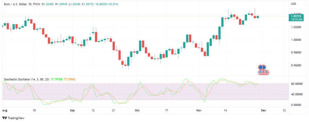
How to Interpret Data from Stochastic Oscillator?
Basically, this chart analysis feature indicates whether the asset is overbought or oversold. When the stochastic oscillator is below 20, it shows the asset is oversold; when it is above 80, it shows the asset is overbought. Differently put, if the indicator goes below 20 and raises above it, it signals long positions. On the other hand, if the indicator goes above 80 but drops below it afterwards, it is a possible short signal.
By way of explanation, the stochastic oscillator comprises of two lines. By default, the blue line indicates the current value of the oscillator, and the red one shows a three-day simple moving average. Since stochastic oscillator follows the momentum, when the lines cross each other, it can be a signal of a trend reversal. Also, the discrepancy between the oscillator and the trend line can signal a reversal. For instance, if the trend shows a lower low, but the oscillator shows a higher low, it indicates that the bearish trend is wearing off, and a bullish trend may take over. I should remind you that stochastic oscillator does not indicate trend direction or reversals when the market is volatile.
Final Words
This article introduced some of the most useful technical analysis indicators in the Forex and crypto market. Each technique produces more exact results when used in conjunction with another tool. I did not want to bombard you with lots of technical analysis information in one post. So, I will post one or two more posts explaining other technical analysis strategies. You can find more information at https://academy.investopedia.com/?aca_ref=header_home_link_1
Disclaimer
The guidelines we mentioned in this article are only for educational purposes. Please do not regard them as financial advice. Note that investing in financial markets requires a comprehensive trading plan. Any rash decision can easily spoil your capital.